

96% of prospects with a legal problem begin their search online, yet most firms remain effectively invisible because they rely on “cheap” or dated law firm logo design ideas. If your visual identity looks like a generic placeholder, you aren’t just losing clicks; you’re handing market share to competitors who treat branding as a strategic weapon. You’ve worked too hard to build a high-level practice only to be undermined by a low-level brand. It’s a disconnect that costs you money every single day.
It’s time to stop blending in and start dominating. You need a visual identity that commands respect and pre-sells your expertise before a prospect even reads your name. This guide reveals how to transform your firm’s image into a high-impact asset designed for total market dominance in 2026. We will examine the shift toward minimalist typography, the technical necessity of dark-mode compatibility, and the critical regulatory shifts like California’s SB 37 that are redefining how elite firms must present themselves to stay compliant and competitive.
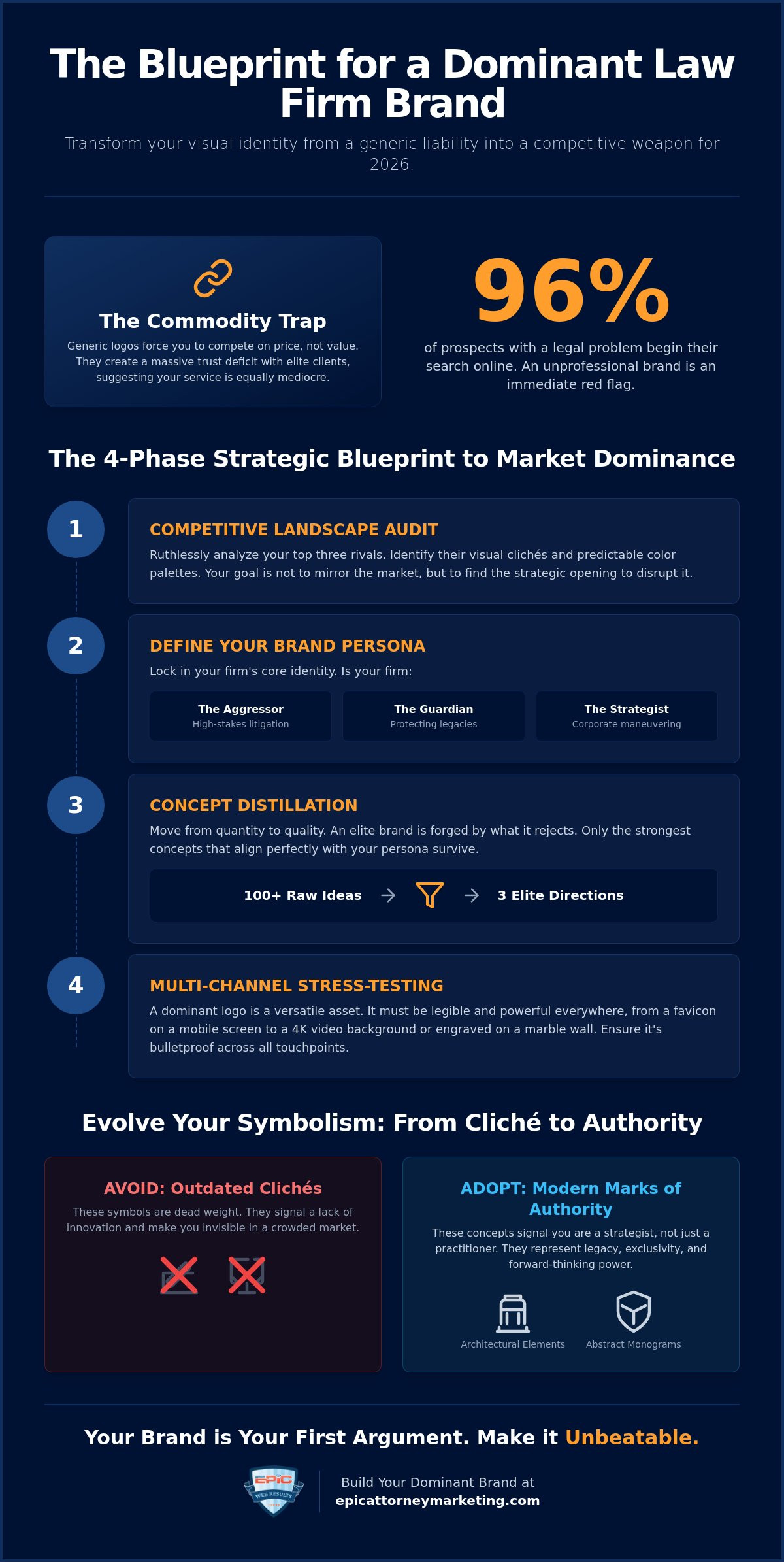
Key Takeaways
- Escape the commodity trap by identifying how generic visual identities create a trust deficit and force you into price-based competition.
- Master a strategic blueprint for law firm logo design ideas that begins with a ruthless competitive audit to ensure your brand stands alone in a crowded market.
- Move beyond tired clichés like gavels and scales by utilizing architectural elements and abstract monograms that signal legacy and exclusivity.
- Leverage psychological triggers through high-stakes color palettes designed to project total authority or disrupt the market status quo.
- Discover how to weaponize your logo as the anchor for a complete visual marketing engine that drives your search engine optimization and social media growth.
Why Generic Law Firm Logos Are Killing Your Firm’s Credibility
Most lawyers treat their visual identity as a decorative afterthought. This is a fatal strategic error. When you settle for generic law firm logo design ideas, you fall straight into the commodity trap. You’re telling the market you’re exactly like the firm down the street. If you look the same, you’ll be forced to compete on price rather than value. This creates a massive trust deficit. Elite clients don’t want “affordable” representation. They want the best. A weak logo suggests your service is equally mediocre.
In 2026, high-net-worth clientele expect a level of sophistication that aligns with the premium fees you charge. They notice when your brand doesn’t match your results. Adhering to solid corporate identity principles isn’t just about aesthetics. It’s about psychological positioning. It’s about moving away from “legal clip art” and toward bespoke brand authority. You aren’t just looking for law firm logo design ideas; you’re building a foundation for market dominance. Regulatory shifts like California’s SB 37 now demand transparency in your office locations, making your digital presence even more critical. If your brand looks dated, no amount of compliance will save your reputation. You need a mark that looks as powerful on a mobile screen as it does on a marble wall.
To see how basic firms approach this process, watch this video on creating a standard visual mark:
The Death of the Gavel and Scale Clichés
Traditional symbols like gavels and scales are dead weight. They signal a lack of innovation. In a digital-first world, these literal icons feel dusty and uninspired. Modern clients want a firm that understands the future, not one clinging to 19th-century imagery. Transitioning to abstract symbols or geometric monograms signals that your firm is a strategist, not just a practitioner. It moves your brand from a literal description of “law” to a representation of “authority.” If your logo looks like it belongs in a textbook, don’t be surprised when clients treat you like a library service instead of an elite partner.
Visual Identity as a Competitive Weapon
Before you sketch a single line, you must define your market position. Are you the aggressor, the guardian, or the master strategist? Your logo is the anchor for your entire law firm marketing strategy. It dictates how prospects perceive your power. A dominant logo doesn’t just look good; it functions as a tactical trust-signal. It pre-qualifies your leads. It tells the world you’re the elite choice before they ever speak to an associate. The cost of a professional rebrand is negligible compared to the revenue lost from high-value leads who bounce because your brand looks “cheap.” Stop settling for participation. Start designing for victory.
The Strategic Blueprint for Law Firm Logo Design Ideas in 2026
Winning in 2026 requires a tactical framework, not a mood board. You don’t stumble upon law firm logo design ideas that crush the competition. You engineer them. Phase one is a ruthless competitive landscape audit. Analyze your top three rivals. If they’re all using navy blue serif fonts, they’ve left a massive opening for you to claim a different psychological territory. Don’t mirror the market. Disrupt it.
Phase two defines your brand persona. Are you the Aggressor, taking ground in high-stakes litigation? The Guardian, protecting family legacies? Or the Strategist, outmaneuvering corporate opponents? Once your persona is locked, move to phase three: concept distillation. Start with 100 raw concepts. Kill 97 of them. Only the elite three directions deserve your attention. Finally, phase four involves stress-testing for multi-channel scalability. A logo that fails on a smartphone screen or a 4K video background is a liability, not an asset. Your brand must be bulletproof across every touchpoint.
Idea Generation for Specific Practice Areas
Your practice area is a mandate for your visual language. Personal injury firms must emphasize aggressive advocacy and recovery. Think sharp angles and bold, forward-leaning typography that suggests momentum. Family law requires a different touch. You need to project unshakable stability and compassion without looking weak. Corporate law demands clinical precision. Your mark should suggest global reach and high-stakes competence through clean, architectural lines. If your logo doesn’t immediately communicate your niche, you’re losing prospects before the first consultation. Specificity is the hallmark of authority.
The ‘Rule of Three’ in Logo Conceptualization
Every elite design must pass the Rule of Three. First, it must be legible in monochrome. If your brand relies on gradients to survive, it’s structurally unsound. Second, it must remain distinct at a small scale, like a browser favicon or a social media profile icon. Third, it must be optimized for high-definition video and digital animation. Many firms fail because they build a logo in a vacuum. Your visual identity must align perfectly with your law firm website design to create a high-performance marketing engine. Balancing a name-centric wordmark with a unique symbol ensures you’re memorable even when the full firm name isn’t visible.
If you’re ready to stop blending in and start scaling your practice, our experts at Epic Attorney Marketing can build the visual foundation your firm deserves.
Beyond the Gavel: Modern Symbols That Command Market Authority
If you’re still hunting for law firm logo design ideas that feature a gavel or a scale of justice, you’re already behind. Elite firms in 2026 use symbols that communicate power without saying a word. Abstract monograms have become the new gold standard for high-stakes practices. They create an “exclusive club” atmosphere that resonates with high-net-worth clients. By interlocking initials in a way that isn’t immediately obvious, you reward the prospect’s attention. This tactical use of negative space suggests your firm sees what others miss. It projects a level of sophistication that a generic icon never will.
Architectural elements provide a different kind of leverage. Use pillars, arches, or foundations to signal legacy. These aren’t just shapes; they’re psychological anchors of strength and permanence. If your firm handles complex litigation, geometric precision is your best friend. Sharp angles and clean lines suggest a surgical legal approach. They tell the client you’re precise. You’re efficient. You’re lethal in the courtroom. When every other firm is using soft, rounded edges, your sharp-angled brand will stand out as the more aggressive, results-oriented option.
Typography: The Silent Authority Builder
Your choice of font is a declaration of intent. Serif fonts represent established legacy and traditional power. They’re for firms that want to feel like they’ve been the dominant force for decades. Sans serif fonts are for the modern disruptor. They suggest speed and tech-forward thinking. Don’t ever use “out of the box” fonts. Elite firms invest in custom typeface design to ensure no one else can replicate their visual voice. Even tiny adjustments in kerning and weight change the perceived power of your firm’s name. A heavier weight signals dominance, while a lighter weight suggests clinical elegance. If your typography looks like a default setting, your firm will look like a default choice.
Minimalism vs. Maximalism in 2026
Most firms should lean toward minimalism. Simple, bold marks win on mobile devices where nearly all initial legal searches begin. A tech-forward lawyer needs a logo that remains distinct at the size of a browser favicon. However, the heritage firm might still benefit from maximalism. If your brand is built on a century of success, a detailed crest or emblem can still be the right move to signal exclusivity. The key is avoiding visual noise. Every line must serve a strategic purpose. If a design element doesn’t contribute to your authority, cut it. Your brand recognition depends on instant, uncompromising clarity.
Psychological Triggers: Choosing Colors for Total Dominance
Color is not a matter of personal preference. It is a tactical tool for neural manipulation. When you evaluate law firm logo design ideas, you must treat color as a psychological trigger that bypasses logic and speaks directly to the prospect’s subconscious. The “Power Palette” of navy, charcoal, and silver remains the gold standard for a reason. These hues broadcast reliability, tradition, and unshakable trust. They tell the client that your firm is an institution, not a temporary service provider. If your goal is to project a “no-nonsense” professional image that justifies premium fees, these colors are non-negotiable.
However, if you’re entering a saturated market dominated by sea-of-blue competitors, you need a “Disruptor Palette.” Emerald green, burnt orange, or deep plum can be weaponized to seize attention. These aren’t just “different” colors; they’re signals of innovation and aggressive growth. Using metallic accents like brushed gold or polished silver further elevates this perception, creating an immediate sense of elite status. You aren’t just another attorney; you’re a high-value asset. Your brand must reflect that exclusivity before the first word of your copy is read. Visibility is the first step toward dominance, and contrast ensures your brand remains legible on every device, from a smartphone to a billboard.
Color Psychology Breakdown
- Blue: The universal signal for reliability. It suggests calm expertise and long-term stability, making it the safest bet for establishing immediate credibility.
- Black and Grey: These shades represent sophistication and authority. They strip away the “fluff” and project a clinical, surgical approach to the law.
- Gold and Silver: These are the hallmarks of success. They suggest high-value results and position your practice as the choice for those who demand the best.
Building a Multi-Tone Brand System
A single primary color is no longer sufficient for a sophisticated digital marketing for attorneys campaign. You need a comprehensive multi-tone system. This includes developing “Accent Hues” specifically designed for call-to-action buttons and digital lead magnets. If your logo is charcoal, a vibrant copper accent can draw the eye toward your contact form with tactical precision. Consistency is the key to total market saturation. Your brand must look identical on a high-end business card as it does on your Google Business Profile. Any deviation in color creates a “friction point” that erodes trust. In the high-stakes world of legal marketing, even a minor inconsistency can cost you a major case.
Don’t leave your firm’s visual authority to chance. Contact the strategists at Epic Attorney Marketing to engineer a brand palette that commands market share.
Executing Your Vision: From Logo Concept to Market Dominance
Your logo is the tactical anchor of your entire operation. It isn’t a decoration; it’s the visual shorthand for your firm’s market power. If your law firm logo design ideas don’t translate into a cohesive visual engine, you’re just throwing money at pixels. A logo must work in tandem with your law firm SEO to turn raw traffic into high-fee clients. Search engines notice when users stick around because they trust what they see. A premium brand reduces bounce rates and signals authority to both Google and your prospects simultaneously.
Your launch plan must be decisive. Don’t bleed the new brand out slowly over several months. Update your Google Business Profile, social headers, and email signatures in a single, coordinated strike. This signals to the market that your firm has evolved. It’s an announcement of intent. Elite firms choose Epic Attorney Marketing because we understand the intersection of high-level design and aggressive growth. We don’t just hand you a digital file; we give you a weapon to crush your local competition. If your visual identity doesn’t scream “market leader,” you’re already losing the war for attention.
Logo Design as a Conversion Trust Signal
If your brand looks dated, you’re inviting prospects to doubt your legal competence. A professional logo acts as a conversion trust signal that immediately lowers bounce rates on your landing pages. There is a direct correlation between visual prestige and your firm’s average lead value. High-net-worth clients gravitate toward brands that look expensive because they equate visual quality with legal success. Precise brand consistency across every digital channel establishes the psychological familiarity needed to drive higher PPC click-through rates and lower your total acquisition costs.
The Epic Approach to Legal Brand Dominance
We don’t “just design logos.” We build comprehensive marketing engines designed for total market saturation. Our methodology aligns your visual identity with your firm’s specific revenue goals. We strip away the fluff and focus entirely on what moves the needle for your practice. If you’re tired of mediocre results from generic vendors, it’s time for a strategic partner who is as ambitious as you are. We ensure your brand isn’t just a pretty picture but a tactical asset that commands respect.
Ready to stop blending in? Command your market with Epic Attorney Marketing.
Forge Your Visual Legacy for Total Market Dominance
Your journey through these law firm logo design ideas has made one thing clear: a logo is never just a picture. It’s a high-stakes tactical asset. To win in 2026, you must abandon the tired clichés that make your practice look like a commodity. You’ve learned how to weaponize abstract symbols, psychological color triggers, and custom typography to pre-sell your authority. These aren’t just aesthetic choices. They’re the mechanics of winning. If your visual identity doesn’t immediately project superiority, you’re leaving revenue on the table for more aggressive rivals.
We’ve spent over a decade perfecting the art of legal sector branding. Our design philosophy is clinical and results-oriented, focusing entirely on lead generation and turning websites into high-performing marketing engines. We don’t just create logos; we engineer dominance. It’s time to align your visual prestige with your actual legal expertise and stop blending into the background of a saturated market.
The market is waiting for a leader. Make sure it’s you.
Frequently Asked Questions
Do I really need a professional logo for my law firm?
You absolutely need a professional logo because it functions as your primary trust signal in a digital-first market. Without one, you’re signaling to high-value prospects that your firm is either amateur or outdated. A professional mark pre-sells your authority and justifies your premium fee structure before a prospect even reads your bio. It’s the foundation of a brand that commands respect and drives growth.
What are the best colors for a modern law firm logo in 2026?
Navy, charcoal, and silver remain the gold standard for projecting institutional trust and reliability in the legal sector. However, 2026 trends favor strategic disruption through emerald green or deep plum to break through heavy market saturation. Your choice must be a tactical decision based on your specific practice area and the competitive landscape you intend to dominate. Don’t pick a color because you like it; pick it because it wins.
Should I use a symbol or just a wordmark for my legal brand?
Elite firms often utilize a hybrid approach, combining a custom wordmark with a unique, abstract symbol. While a wordmark ensures your name is the hero, a symbol creates a recognizable “exclusive club” feel that works better as a social media icon or browser favicon. Your decision should prioritize multi-channel scalability and instant brand recognition across every digital touchpoint your firm occupies.
How much does a custom law firm logo design cost?
When researching law firm logo design ideas, expect industry costs for 2026 to range from $200 to $2,500 for freelancers and $2,000 to over $15,000 for elite agencies. You aren’t just buying a graphic; you’re investing in a market position. The true cost of a cheap logo is the high-value cases you lose because your brand looks amateur compared to your results. View this as a capital investment in your firm’s future.
Can I use a logo maker for my new practice?
You can technically use a DIY tool, but most law firm logo design ideas found in those makers are generic templates that trap you in the commodity lane. If you want to dominate your market, you need a bespoke identity that can’t be replicated for a few dollars. A template brand tells prospects you’re a budget provider rather than a master strategist. Don’t sabotage your firm’s credibility for a short-term saving.
What should I avoid in my law firm logo design?
Avoid the “legal clip art” graveyard of gavels, scales of justice, and Greek pillars. These clichés signal a lack of innovation and make your firm look like every other mediocre competitor in your city. You must also eliminate visual noise and complex gradients that fail to render clearly on mobile devices or in dark mode environments. Clarity is power; anything that distracts from your authority must be cut.
How does my logo affect my firm’s SEO and online presence?
Your logo directly impacts your SEO by serving as a critical trust signal that reduces bounce rates on high-traffic landing pages. When prospects see a prestigious visual identity, they stay on your site longer, which signals to Google that your content is authoritative. Additionally, a memorable mark drives brand-specific searches. This is a powerful indicator of market relevance that search engines reward with higher rankings.
How often should a law firm update its logo or branding?
Most elite firms audit their visual identity every five to seven years to ensure they aren’t falling behind modern design standards. You should trigger a rebrand whenever there’s a shift in leadership, a move into new practice areas, or a clear disconnect between your results and your brand. Stagnation is the first step toward irrelevance. If your brand doesn’t reflect your current level of success, it’s already obsolete.